*This post may contain affiliate links for which I earn commissions.*
Arranging a small living room can feel surprisingly difficult.
I’ve found that it’s rarely about having too little space. It’s more about not knowing how to use the space well. When furniture is pushed against walls, the room feels cramped or awkward, and nothing quite flows.
The good news is this: layout matters more than size.
Once you choose the right layout, even a small living room can feel calm, open, and intentional.
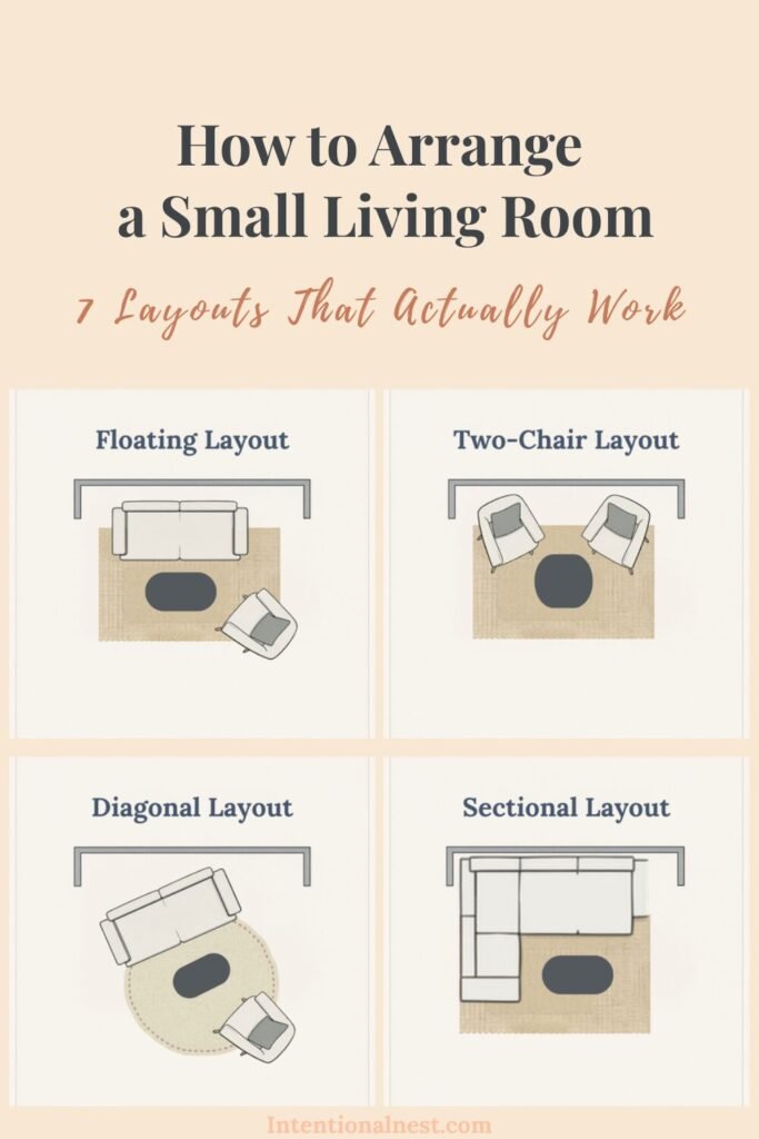
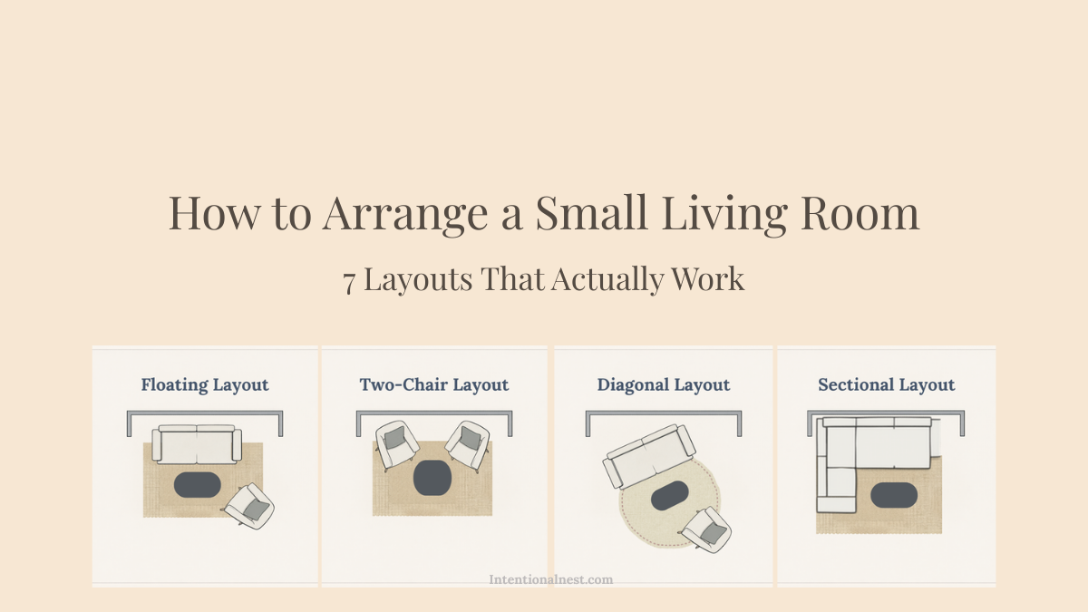
In this guide, I’ll walk you through 7 small living room layouts that actually work, with simple diagrams and practical tips you can apply right away.
If you’re still shaping your overall space, I go deeper into layout, furniture, and flow in my Small Living Room Guide—but this will help you choose the right starting point.
Quick Layout Selector
If you’re not sure where to start, this will help you quickly find the right direction:
| If your room is… | Try this layout |
|---|---|
| Small and square | Floating layout |
| Long and narrow | One-wall layout |
| Open-plan | Zoned layout |
| You need maximum seating | Sectional layout |
| Very compact | Two-chair layout |
| Awkward or asymmetrical | Corner / diagonal layout |
| You want a calmer, non-TV space | Focal point layout |
1. Floating Furniture Layout (Best for Small Square Rooms)
When to Use This Layout
I reach for this layout when a room feels tight but not necessarily narrow.
It’s especially helpful if:
- Your room feels “boxed in”
- There’s no clear focal point
- You want the space to feel more intentional and less like everything was just placed wherever it fit
How This Layout Works
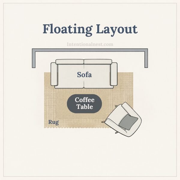
Instead of pushing everything against the walls, you bring the furniture slightly inward.
- Pull the sofa 4–12 inches away from the wall
- Use a rug large enough to sit under the front legs of your furniture
- Center a coffee table to anchor the layout
- Use a slim console or leave breathing room behind the sofa
Layout Diagram
Why This Layout Works
It creates visual breathing room around the edges and makes the space feel intentional and more designed rather than crowded. With the rug anchoring the space, it feels cohesive instead of scattered.
It also improves flow. You’re not hugging the walls — you’re moving through a space that feels defined.
Common Mistakes to Avoid
The biggest mistake here is choosing a rug that’s too small.
When the rug covers only the area beneath the coffee table, the room loses visual cohesion. The furniture will feel disconnected, like it’s floating for no reason.
A better rule:
- At a minimum, the front legs of your sofa and chairs should sit on the rug
If you get this right, the entire layout clicks into place.
Pro Tip
If you’re nervous about pulling the sofa away from the wall, start small.
Even shifting it forward by 4–6 inches can change how the room feels. You don’t need a huge gap. You just need enough space to break that “everything pushed against the wall” look.
2. One-Wall Layout (Best for Long, Narrow Rooms)
When to Use This Layout
I use this layout when a living room feels more like a passageway than a place to sit and relax.
If your space is long and narrow, or you find yourself constantly walking through it to get somewhere else, this layout helps bring order and calm.
It works especially well if:
- Your room has limited width
- There’s a clear walkway you need to maintain
- Furniture placed in the center makes the room feel cramped
- You’re working with a small apartment or an open circulation path
How This Layout Works
Instead of trying to “fill” the room, this layout simplifies everything by anchoring your main furniture along one wall.
I usually:
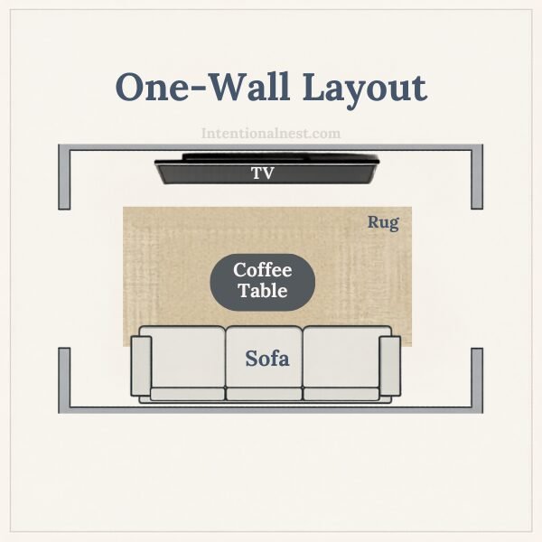
- Place the sofa directly against the longest wall
- Position the TV or focal point on the opposite wall
- Keep the center of the room as open as possible
- Add a coffee table only if there’s enough clearance
If space is tight, I’ll skip the coffee table entirely and use a small side table instead. The goal here isn’t to maximize furniture—it’s to improve flow.
Layout Diagram
Why This Layout Works
Narrow rooms can feel frustrating because there’s no obvious place for everything to go.
This layout removes that pressure.
- It creates a clear, uninterrupted pathway through the room
- It reduces visual clutter by keeping furniture in one zone
- It makes the space feel wider, even if the dimensions haven’t changed
Instead of fighting the shape of the room, you’re working with it.
Common Mistakes to Avoid
The biggest mistake I see is trying to “balance” the room by adding furniture on both sides.
In a narrow space, this usually backfires:
- The walkway becomes tight
- The room feels crowded
- Movement through the space becomes awkward
It’s better to commit fully to one side and keep the rest open.
Pro Tip (Adds Practical Depth)
If your layout feels too flat or one-dimensional, add variation through scale, not more furniture.
For example:
- Use a slightly larger rug to define the seating area
- Add a slim console or shelf behind the sofa
- Choose a coffee table with softer edges (like oval or round)
These small adjustments keep the layout functional while making it feel more considered.
3. Zoned Layout (Best for Open-Plan Spaces)
When to Use This Layout
I use this layout when a living room isn’t really a “room” at all, but part of a larger open space.
If your living area flows into a dining space, kitchen, or even a work zone, this layout helps everything feel organised without adding walls.
It’s especially useful if:
- Your space feels undefined or scattered
- Furniture placement feels random rather than intentional
- You need the room to serve more than one purpose
How This Layout Works
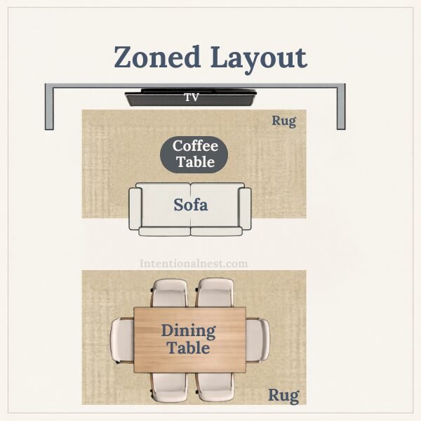
Instead of treating the entire area as one big room, you divide it into clear zones, each with its own purpose.
For the living area, I usually:
- Use a rug to define the seating zone
- Position the sofa to subtly “separate” the living space (often facing inward or away from other zones)
- Add a coffee table to anchor the center
- Use lighting (like a floor lamp) to reinforce the zone
The key is that the furniture itself creates boundaries without closing off the space.
Layout Diagram
Why This Layout Works
Open spaces often feel chaotic, not because they’re too small, but because nothing is clearly defined.
Zoning solves that.
- The rug visually tells your brain: this is the living area
- The sofa placement creates a natural boundary
- Each zone feels intentional, even though everything remains open
The result is a space that feels calm, organised, and much easier to live in.
Common Mistakes to Avoid
The biggest mistake is trying to keep everything visually “open” by skipping anchors like rugs or defined furniture groupings.
Ironically, this makes the space feel more cluttered, not less.
Without zones:
- Furniture looks randomly placed
- The room lacks structure
- Nothing feels finished
You don’t need walls, but you do need boundaries.
Pro Tip
If your space still feels a bit undefined, use one subtle divider:
- A slim console table behind the sofa
- An open bookshelf
- Or even just a change in lighting between zones
You’re not trying to separate the space completely, just guide how it’s used.
4. L-Shaped Sectional Layout (Best for Maximum Seating)
When to Use This Layout
I use this layout when seating is a priority, but the space still needs to feel calm and not overcrowded.
A sectional can actually work surprisingly well in a small living room if it’s the right size and is placed carefully.
It’s especially useful if:
- You regularly need seating for 3–4 people
- You want a more relaxed, lounge-like feel
- You’d prefer one larger piece instead of multiple smaller ones
- Your room has a clear corner that can anchor the layout
How This Layout Works
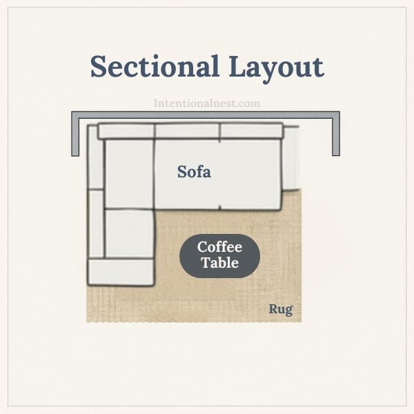
Instead of combining a sofa and chairs, the sectional serves as the main structure of the room.
I usually:
- Place the sectional into a corner to define the seating area
- Let the longer side follow the main wall
- Use the shorter side (the chaise or return) to subtly frame the space
- Add a compact coffee table at the center
- Anchor everything with a rug that extends beyond the sectional edges
This layout naturally creates a contained, cohesive zone without needing additional pieces.
Layout Diagram
Why This Layout Works
A sectional simplifies decision-making. Instead of figuring out how multiple pieces relate to each other, you’re working with one clear anchor.
- It maximises seating without adding visual clutter
- It defines the living area instantly
- It creates a comfortable, cohesive arrangement
In many cases, it actually feels less busy than a sofa plus two chairs.
Common Mistakes to Avoid
The biggest mistake is choosing a sectional that’s too large or bulky for the room.
When that happens:
- The layout feels boxed in
- Movement around the room becomes restricted
- The space loses its sense of openness
A better approach is to:
- Choose a compact or apartment-sized sectional
- Look for slimmer arms and raised legs
- Leave at least a few inches of breathing room from the walls
Pro Tip
Think carefully about which side the chaise should be on. It makes a bigger difference than most people expect.
- Place the chaise on the side that won’t block movement through the room
- If your room connects to another space, keep that pathway open
- When in doubt, position the chaise along the least-used side
This small decision can completely change how functional the layout feels.
5. Two-Chair Layout (Best for Very Small Spaces)
When to Use This Layout
I use this layout when a sofa feels like it’s taking over the room.
In very small living rooms, a standard sofa can quickly make the space feel heavy and cramped—even if everything else is minimal. Replacing it with two chairs can completely shift that feeling.
This layout works especially well if:
- Your living room is very compact
- You don’t need seating for multiple people at once
- You want a lighter, more flexible setup
- You prefer a calmer, more intentional space
It’s also a good option if your living room is part of a larger space and doesn’t need to do everything.
How This Layout Works
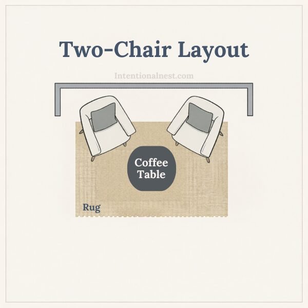
Instead of anchoring the room with a sofa, you create a small, balanced seating area using two chairs.
I usually:
- Place two armchairs opposite or slightly angled toward each other
- Add a small coffee table or side table between them
- Use a rug to define the area and bring everything together
- Keep the scale of each piece slightly smaller than standard
If there’s a TV, both chairs can angle subtly toward it. But often, I keep this layout more conversation-focused.
Layout Diagram
Why This Layout Works
The biggest advantage here is how much space it frees up, both physically and visually.
- Without a sofa, the room instantly feels more open
- There’s more flexibility to move things around
- The layout feels lighter and less fixed
It also changes how the space is used. Instead of everything being oriented around one direction, it becomes more about conversation, reading, or simply relaxing.
And in a small home, that kind of flexibility makes a noticeable difference.
Common Mistakes to Avoid
The most common mistake is choosing chairs that are too large or bulky and essentially recreating the same problem as a sofa.
To avoid that:
- Look for chairs with slimmer arms or armless designs
- Choose styles with visible legs to keep the space feeling open
- Keep proportions in check relative to the room
Another mistake is skipping the rug. Without it, the layout can feel disconnected and unfinished.
Pro Tip (For Adding Seating)
If you’re worried about not having enough seating, think in layers rather than size.
You can:
- Add a small stool or pouf that can move around easily
- Bring in an extra lightweight chair when needed
- Use a side table that doubles as a perch in a pinch
This keeps the layout flexible without committing to a larger piece of furniture.
6. Corner / Diagonal Layout (Best for Awkward Rooms)
When to Use This Layout
I use this layout when the living room shape is unusual, and placing the sofa against the walls feels awkward.
Some living rooms aren’t perfectly square or easy to work with. They might have:
- Awkward proportions
- Angled walls
- Off-center windows or doorways
- A layout that never quite feels balanced
In those cases, trying to keep everything aligned with the walls can actually make the space feel more rigid.
This layout works especially well if:
- Your room feels visually unbalanced
- Standard layouts don’t seem to fit
- You want the space to feel softer and more relaxed
How This Layout Works
Instead of following the lines of the room, you gently break them.
I usually:
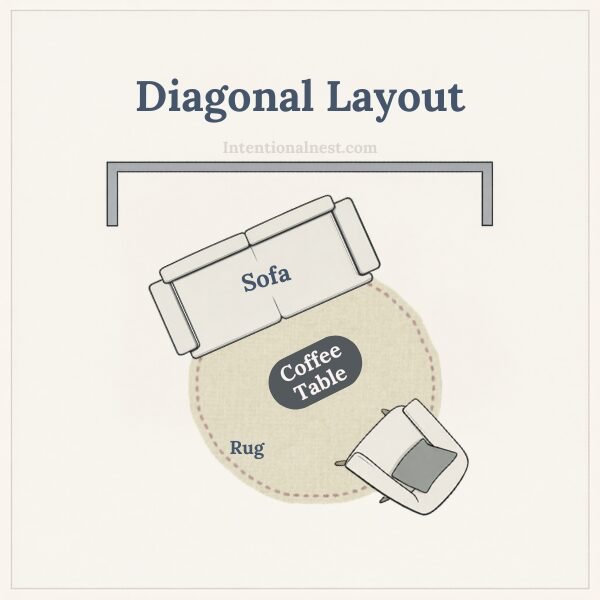
- Place the sofa at a slight angle, often near a corner but not pushed tightly into it
- Angle the rug to match the direction of the seating, or use an oblong or roundish rug
- Center a coffee table within that angled layout
- Position a chair opposite or adjacent, angled inward toward the sofa
The key is that everything relates to the center of the layout, not the walls.
Layout Diagram
Why This Layout Works
Angled layouts soften a space.
- They break up rigid lines and right angles
- They make the room feel more dynamic and less boxy
- They help disguise awkward proportions
In a room that feels slightly “off,” this layout can make things feel more balanced as you’re no longer trying to force symmetry where it doesn’t naturally exist.
Common Mistakes to Avoid
The biggest mistake is overcommitting to the angle.
If everything is too sharply rotated, the layout can start to feel chaotic rather than intentional.
To avoid that:
- Keep the angle subtle
- Make sure the coffee table remains centered
- Maintain clear pathways around the layout
Another common issue is pushing the sofa too tightly into the corner. Even in this layout, a little breathing room makes a big difference.
Pro Tip (Adds Practical Depth)
If you’re unsure about committing to a diagonal layout, start with just one element.
For example:
- Angle the rug slightly first
- Then adjust the coffee table and seating to follow
This change feels more natural and allows for easier experiments without rearranging the entire room at once.
7. Focal Point Layout (Best for Calm, Intentional Spaces)
When to Use This Layout
I use this layout when I want a living room to feel calmer and less driven by screens or habit.
In many small spaces, everything ends up arranged around the TV by default. And while that can work, it’s not always what makes a room feel good to be in.
This layout works especially well if:
- You want your space to feel more relaxed and less TV-focused
- You have a strong natural focal point (like a window or artwork)
- You’re designing a space for conversation, reading, or quiet time
- Your current layout feels functional but not particularly inviting
How This Layout Works
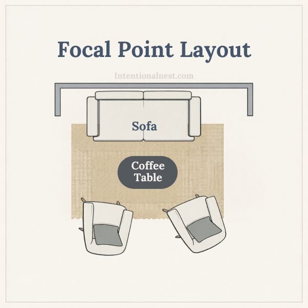
Instead of centering everything around a TV, you choose a focal point that feels more intentional and build the layout around that.
I usually:
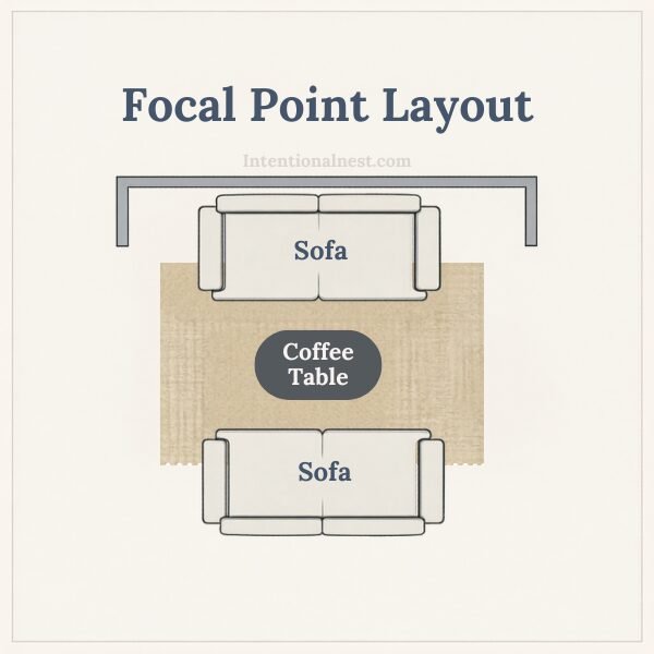
- Arrange seating inward, facing a central point (like a coffee table or window)
- Keep the layout balanced on all sides rather than directional
- Use a rug to anchor the space
- Let the focal point guide where the eye naturally lands
That focal point might be:
- A large piece of artwork
- A window with natural light
- A coffee table styled simply
- Or even just the center of the room itself
The goal is to create a space that feels grounded and visually calm.
Layout Diagram
Or with two sofas. Again, conversation is the main focus of the space, and the coffee table is the focal point.
Why This Layout Works
Why This Layout Works
What changes here isn’t just the layout, it’s the feeling of the room.
- The space becomes more balanced and less directional
- Your eye isn’t pulled toward a single dominant object
- The room feels softer, quieter, and more intentional
In a small living room, that shift can make the space feel more like a retreat than just a place to sit.
Common Mistakes to Avoid
The biggest mistake is trying to combine this layout with a dominant TV setup.
When both compete:
- The room loses clarity
- The layout feels confused
- The focal point becomes diluted
If a TV is necessary, it helps to:
- Keep it visually minimal (mounted or low-profile)
- Avoid making it the central anchor of the layout
Pro Tip
If you’re not ready to fully remove the TV as the focal point, you can soften its presence instead of eliminating it.
For example:
- Place seating slightly angled rather than directly facing it
- Introduce a secondary focal point (like an artwork or a window)
- Keep the center of the room visually balanced
This allows the space to feel more intentional without losing functionality.
Design Your Own Layout (Optional Next Step)
If you want to test these layouts before moving furniture, simple tools like Planner 5D or Roomstyler 3D Home Planner can help you map your space and experiment with different arrangements.
Even a quick plan can save a lot of trial and error.
Final Thought
You don’t need more space—you need the right layout.
Start with one that fits your room shape and how you actually live, and the rest becomes much easier.